Back Антыква Byelorussian Антыква BE-X-OLD Antikva Czech Antikva Danish Antiqua German Klasika tiparo Esperanto Antiqua Spanish Antiikva Finnish Antiqua French Antiqua Italian


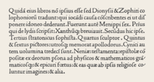
Antiqua (/ænˈtiːkwə/)[1] is a style of typeface used to mimic styles of handwriting or calligraphy common during the 15th and 16th centuries.[2] Letters are designed to flow, and strokes connect together in a continuous fashion; in this way it is often contrasted with Fraktur-style typefaces where the individual strokes are broken apart. The two typefaces were used alongside each other in the Germanophone world, with the Antiqua–Fraktur dispute often dividing along ideological or political lines. After the mid-20th century, Fraktur fell out of favor and Antiqua-based typefaces became the official standard in Germany. (In German, the term "Antiqua" refers to serif typefaces.[3])
- ^ "antiqua". Oxford English Dictionary (Online ed.). Oxford University Press. (Subscription or participating institution membership required.)
- ^ Eisenstein, Elizabeth (12 September 2005). The Printing Revolution in Early Modern Europe. Cambridge University Press. pp. 123–163. ISBN 978-0-521-84543-4.
- ^ "Renner Antiqua – Reviving a serif typeface from the designer of Futura". Linotype.
Antiqua is a term used in German to denote serif typefaces, many of them oldstyles (Garamond-Antiqua, Palatino-Antiqua, etc.). The word is used in very much the same way as "roman" [is used] in English-speaking typography to differentiate between upright and italic typefaces in a family.